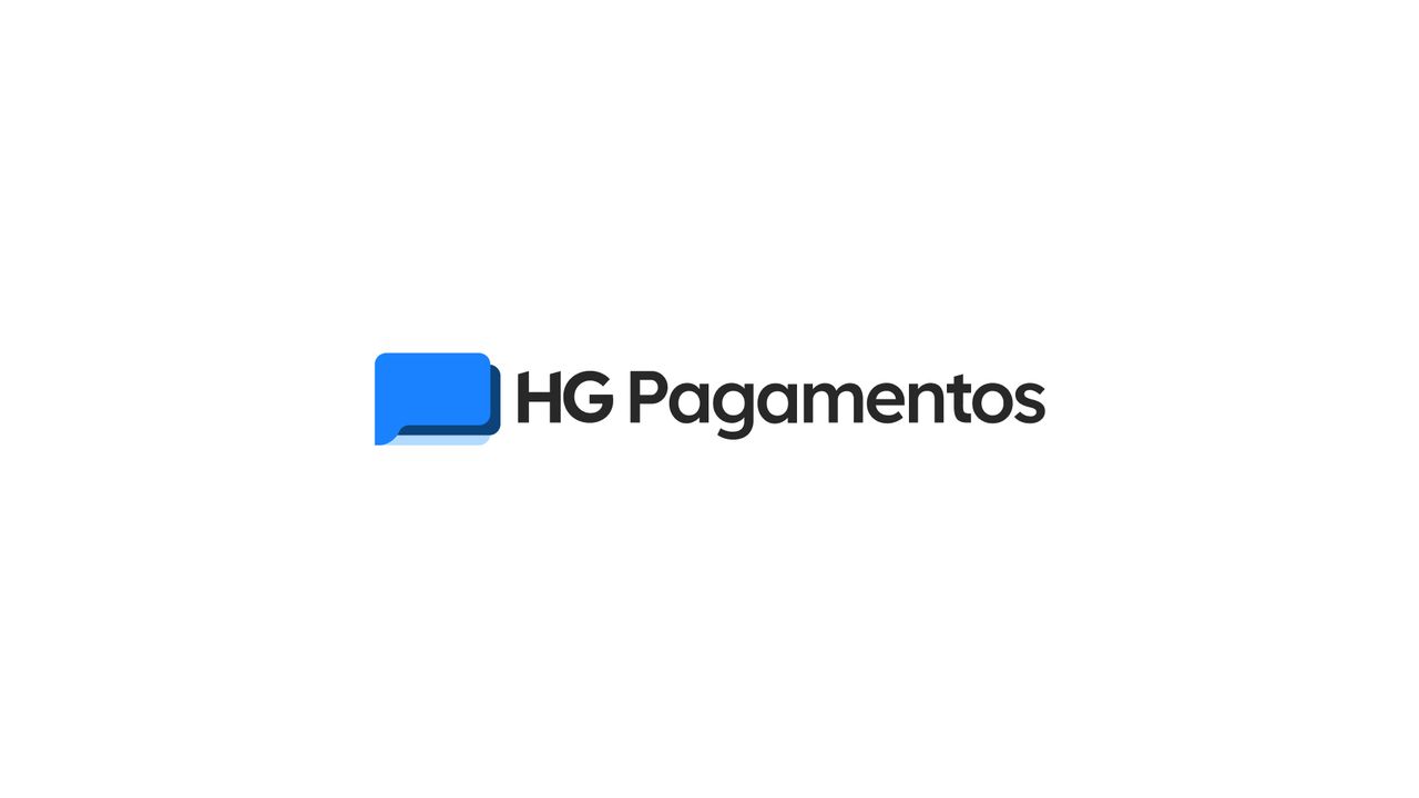
HG Pagamentos
A brand for people who move money.
A brand that has to look like a bank without looking like paperwork
- Problem
- A new sub-acquirer needs to convey the security of a financial institution without inheriting the coldness of the sector.
- What I did
- A symbol built on an equation of three concepts, with geometry and typography documented for consistent reproduction.
- Outcome
- Brand approved and applied, with a construction manual that now serves as the base for the product's design system.
 02
02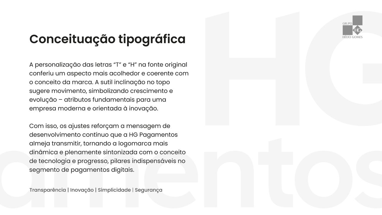 03
03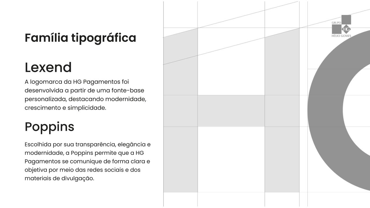 04
04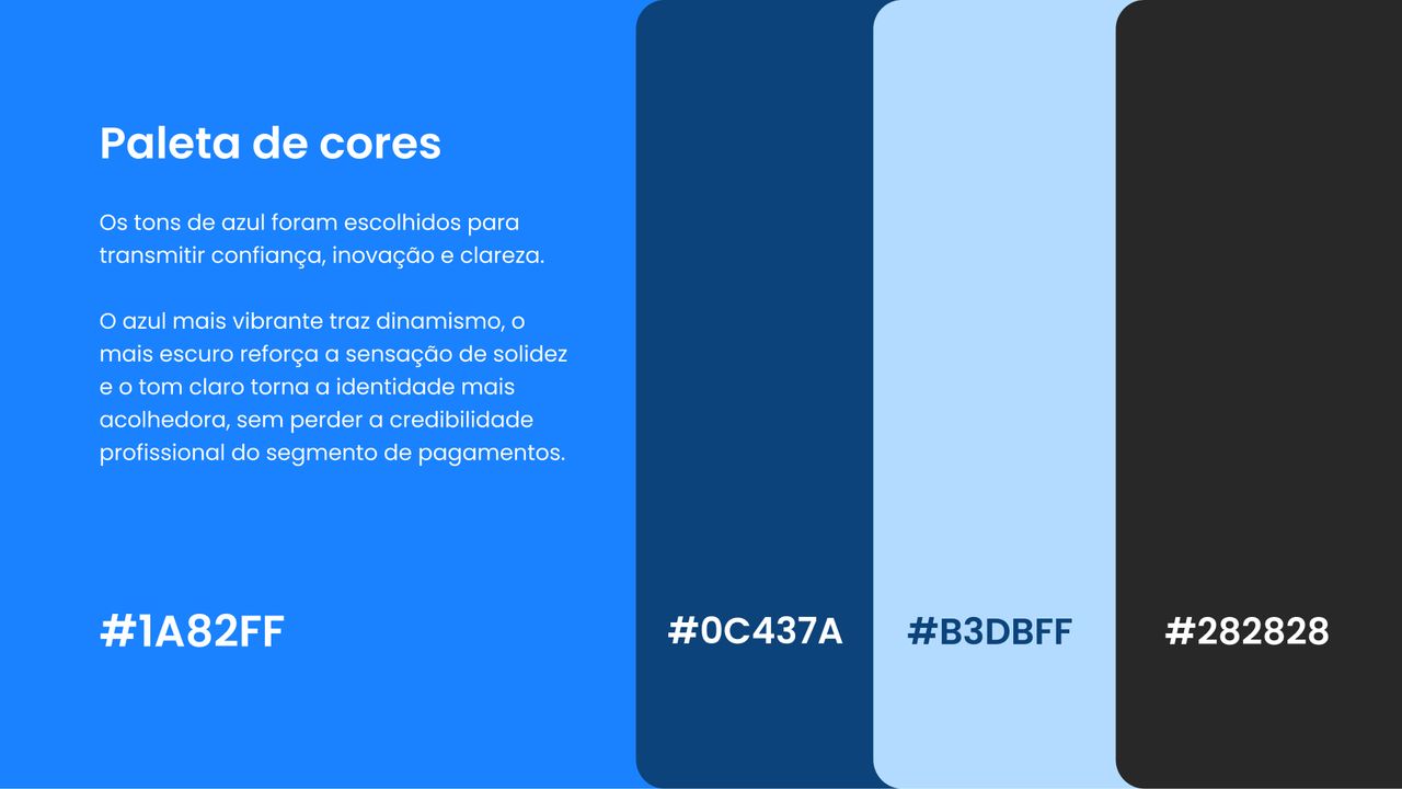 05
05- 06
 07
07
Full processContext, decisions and evidence, for those who want the detail.
Context
HG Pagamentos is Grupo Hélio Gomes' sub-acquirer — the layer sitting between the merchant and the acquirer, processing the transaction and absorbing part of the risk. It is a business that only exists if people trust it: sellers need to believe the money arrives, and buyers need to believe their data does not leak.
The platform is built in-house by the group, which meant the brand was never going to stay on stationery. It was going into a product — checkout screens, merchant dashboards, receipts. That changed the weight of every decision: anything I drew had to survive at 24 px tall in a navigation bar, not just on a presentation cover.
Positioning, purpose and the six emotional brand values arrived already defined by the client. My work started where the strategy ended: turning that into form.
The problem
Read together, the attributes the client wanted to communicate are a contradiction:
Solid and trustworthy · Modern and technological · Serious and objective · Friendly and accessible
Solidity and seriousness pull toward banking vocabulary — rigid geometry, institutional blue, serifs, symmetry. That is how the financial sector has drawn itself for seventy years, and it works: it looks safe. It also looks unapproachable, and HG's customer is not a big-bank account holder. It is the small business owner who has already been treated with suspicion by a financial institution and has no interest in repeating the experience.
Pulling the other way — fintech vocabulary, warm colours, organic shapes, casual tone — fixes accessibility and destroys credibility. Nobody hands over a month's revenue to a brand that looks like a food delivery app.
The brand had to occupy both positions at once, rather than the lukewarm average between them.
My role
- Symbol concept and design
- Geometric construction and proportion documentation
- Typographic customisation of the wordmark on Lexend
- Supporting type family definition
- Colour system
- Brand variations and presentation deck layout
What was not mine: positioning, purpose and the six emotional values came ready from the client. I ran no market research and interviewed no merchants — the strategy was settled before I came in, and the case here is one of visual translation, not discovery.
Process
I started from the contradiction, not from sketching. Before drawing anything, I split the four attributes into two opposing pairs and assumed the answer was not picking a side but assigning each axis to a different layer of the identity: the form would carry solidity, and colour and typography would carry approachability. If each layer solves one half, the brand as a whole can be both things without reading as undecided.
That gave the rest of the project a decision rule. Every time a choice came up — rounder or sharper, darker or more saturated blue — the question was never "which looks better", it was "is this element solving the axis assigned to it".
Key decisions
1. The symbol as an equation, not an illustration
The obvious temptation in a payments business is to draw the object: a card, a currency sign, a padlock. All of them are worn out, and all of them say one thing only.
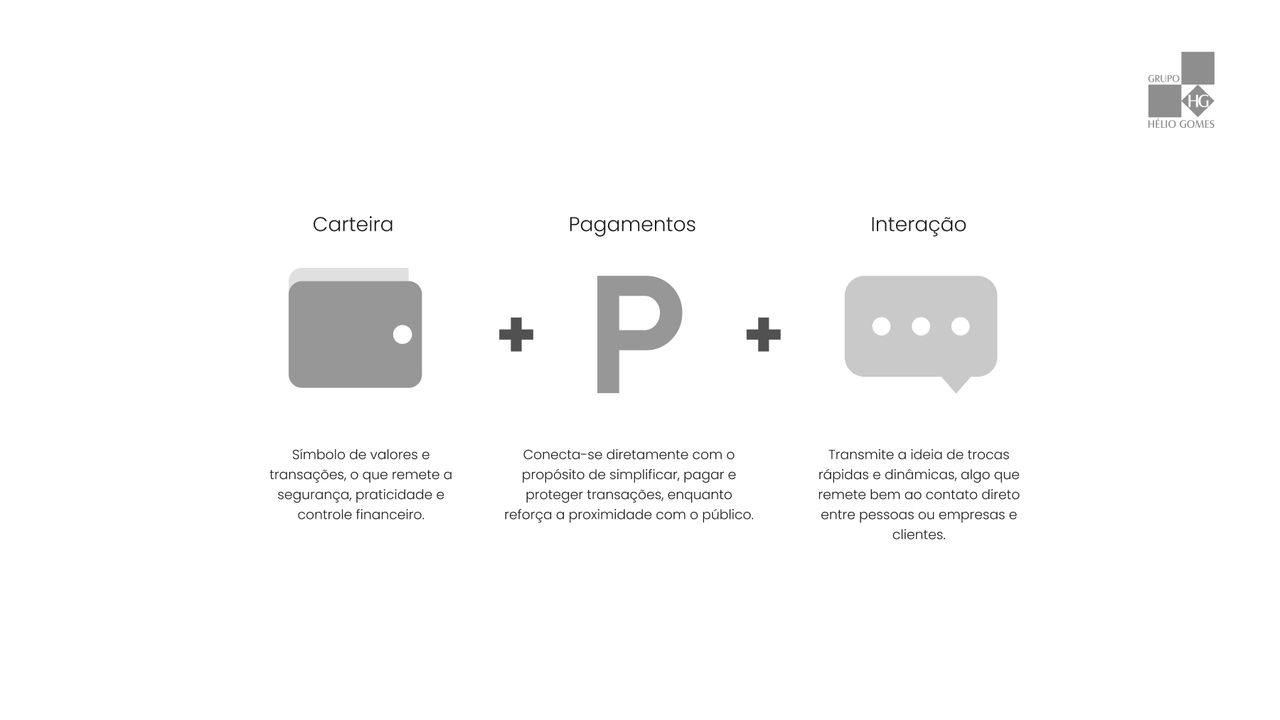
Instead, I built the symbol as the sum of three ideas the business has to hold at the same time:
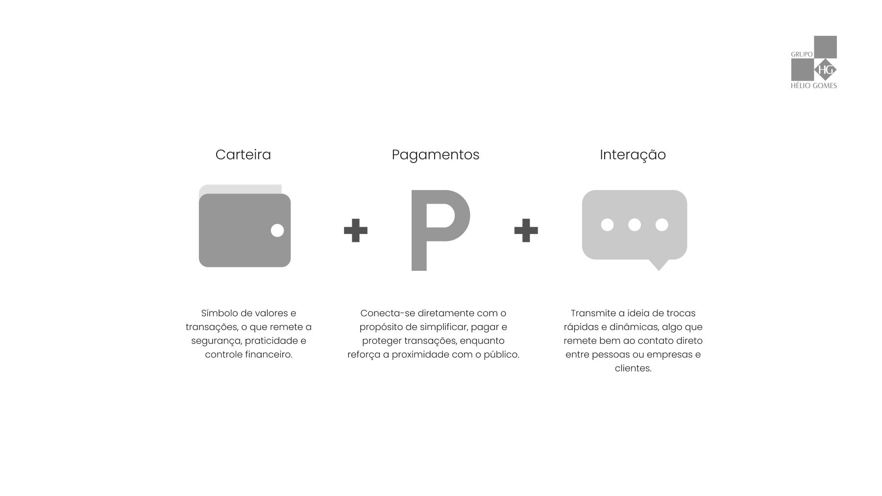
- Wallet — value and transactions. Security, practicality, control.
- Payments — the literal purpose: simplify, pay, protect.
- Interaction — fast exchanges between people and businesses, direct contact.
The result is three rounded rectangles overlapping in depth. Stacked, they read as cards inside a wallet. But the lower-left cutout also makes them read as a speech bubble — and that second reading is what brings the approachability the solid form alone would never carry.
The ambiguity is deliberate. It is the entire point of the brand, and the reason it works on both axes at once.
2. Geometry documented before the brand was approved
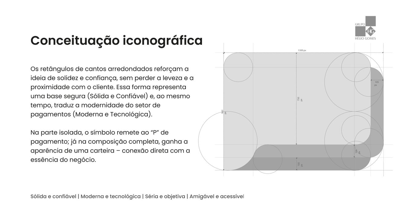
The symbol was going to live inside a product built in-house, by developers who were never going to call me to ask what the corner radius was. If the construction were not dimensioned, every reimplementation would invent its own — and three months later there would be four versions of the same symbol in the system.
So I documented the construction alongside the drawing, not after it: a 105 px radius over a 1300 px width, with each plate's proportions fixed relative to the primary one.
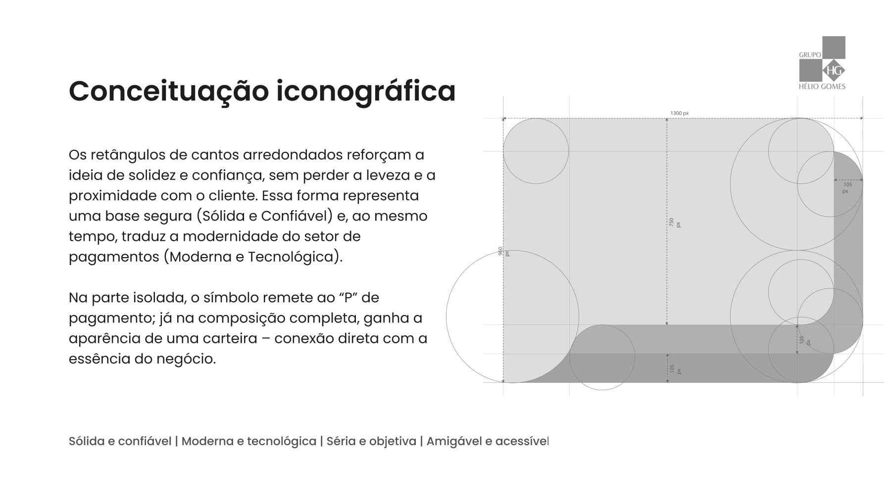
The radius is the decision carrying the accessibility axis. Sharp corners would have delivered the requested solidity and nothing else; too large a radius would have turned the brand into something light and disposable. The chosen value is the point where the form still reads as a solid base but no longer reads as institutional.
3. Customising two letters instead of drawing an alphabet
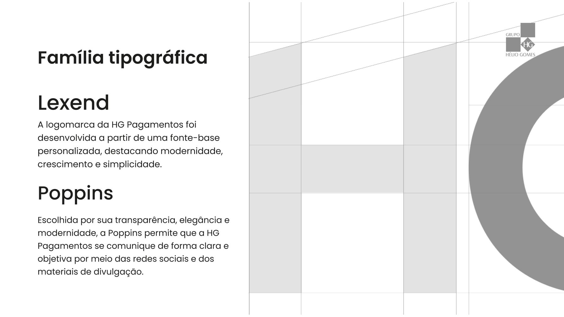
The wordmark started from Lexend — a typeface designed for legibility, which matters when the name has to appear shrunk inside a checkout.
Drawing a wordmark from scratch would have been more authorial and worse for the client: more expensive, slower, and impossible to extend later without calling me back. Instead I customised only what needed a signature — the T and the H, with a subtle tilt at the top:
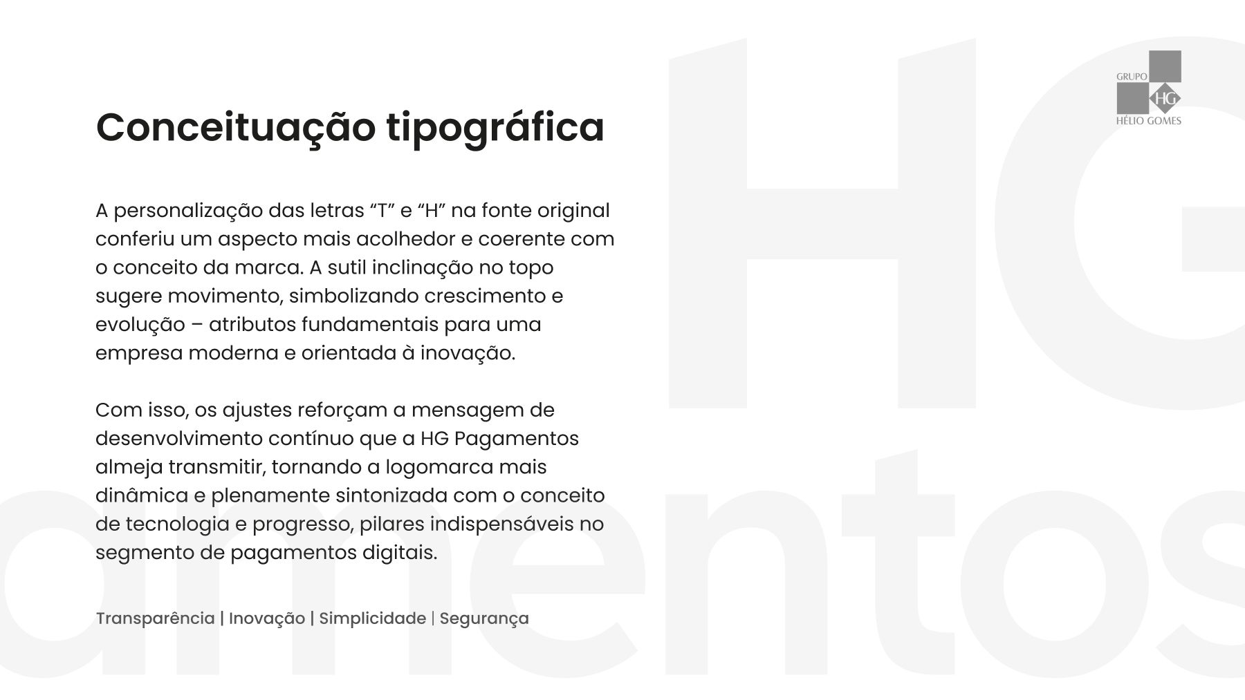
The tilt does two things at once. It breaks the rigidity of the grid — the "friendly" part — and it suggests upward movement, which is the growth the merchant is buying. Two altered letters change the temperature of the whole without the cost of a full alphabet.
For everyday communication, Poppins: geometric, clear, without the institutional weight of a classic grotesque.
4. Three blues with distinct jobs, not a palette of taste
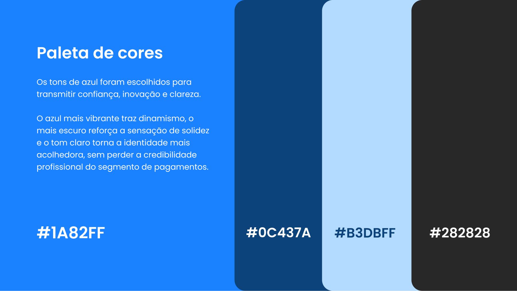
Blue is the financial sector's cliché, and using it was a conscious choice: defying colour expectations in a business that sells trust costs more than it returns. The work was not avoiding blue, it was splitting it into roles:
#1A82FF— the vibrant blue. Action, movement, the thing you click.#0C437A— the dark blue. Structure and depth; this is what holds up the "solid and trustworthy" axis.#B3DBFF— the light blue. Air and lightness, the counterweight that keeps the whole from turning heavy.#282828— the neutral. Text and wordmark, so colour never competes with reading.
The distinction matters because the brand was going inside a product. A palette chosen for harmony becomes an argument every time someone has to decide a button's colour. A palette with assigned roles answers on its own.
Outcome
The brand was approved and applied, with the symbol, wordmark, dimensioned construction, type family and colour system documented in the presentation deck.
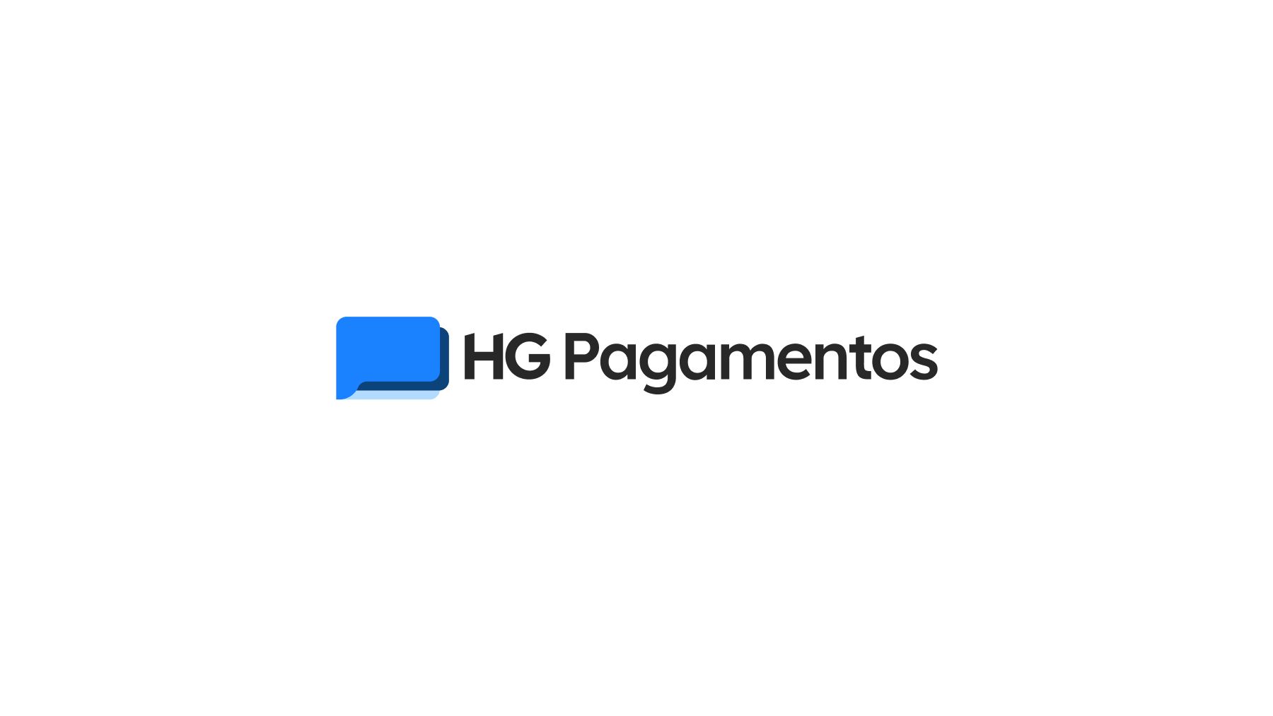
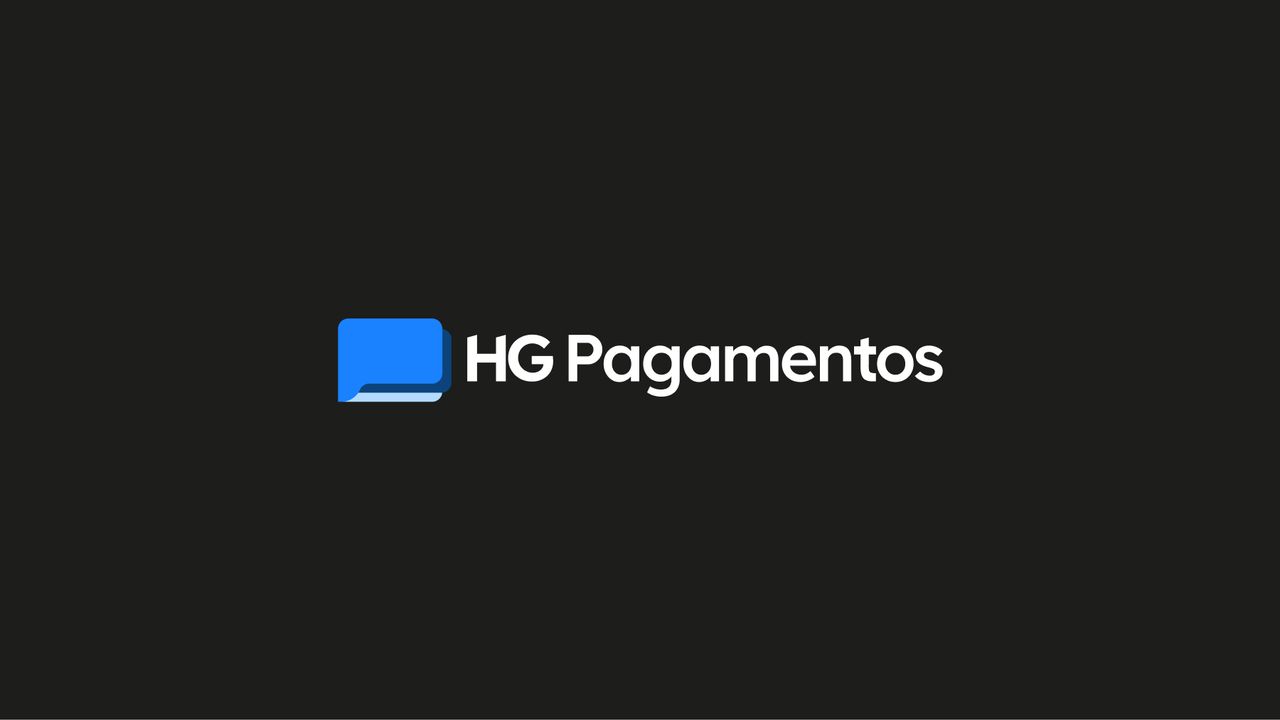
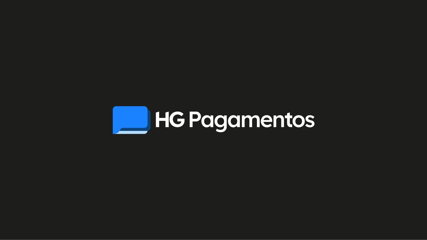
The variations cover the backgrounds the brand needed to exist on — light, blue and dark blue — keeping the symbol legible on each:
I have no business metrics from this project. Brand recognition, conversion impact and merchant adoption are data that stayed with the client, and I am not going to invent a number to close a case with a chart. What can be verified is what is above: the brand exists, it is consistent, and it is reproducible.
What is still open
The deliverable is a presentation deck, not a brand manual. What a brandbook would solve is missing:
- Misuse rules — what not to do with the symbol (distort, recolour, place on low-contrast backgrounds).
- Clear space and minimum size — the construction is dimensioned, but the space around it and the smallest legible size are not.
- A rule for choosing between variations — all three exist, but nothing says which to use when.
What I would do differently
I spent all the documentation effort on the symbol's construction and almost none on usage rules — and that proportion was inverted relative to what the client actually needed.
The dimensioned geometry was the part I wanted to draw, and I convinced myself it was also the most important because the symbol was going into a product. But whoever reimplements the symbol does it once. Whoever decides which variation to use in a post, a contract or on a dark background does it every week, and for that person I left nothing. Handing over three variations with no selection criteria is not giving the client freedom — it is handing back a design decision that was mine to make.
Today I would trade half the geometric detail for a page of "when to use which", even if that made the presentation less handsome. And I would have defined the minimum size in the same session I defined the corner radius, because those two decisions are the same decision seen from different distances.
Outcomes are qualitative: I'm not cleared to publish these projects' metrics.
 Next →Micro-interactionsMotion that explains the interface.