Braip App — Launch
Your sales in the palm of your hand.
Sixty seconds to show a whole app — sales, withdrawals and biometrics — without one word too many.
- Problem
- The new app was ready, but a static screenshot doesn't show what changed — and in the feed a seller decides in two seconds whether to stop or scroll.
- What I did
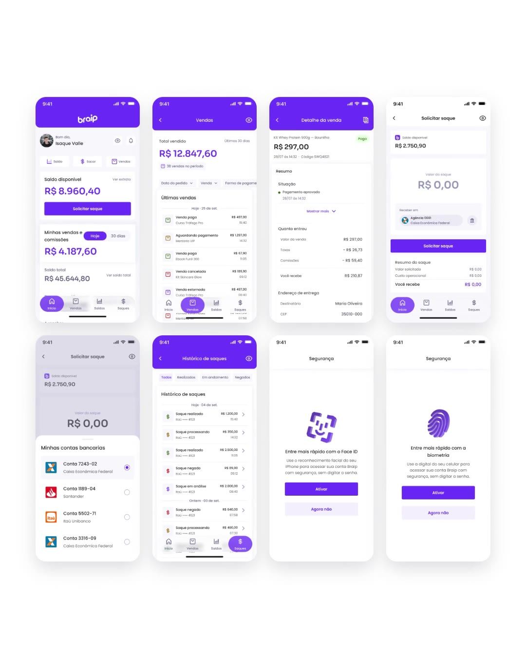
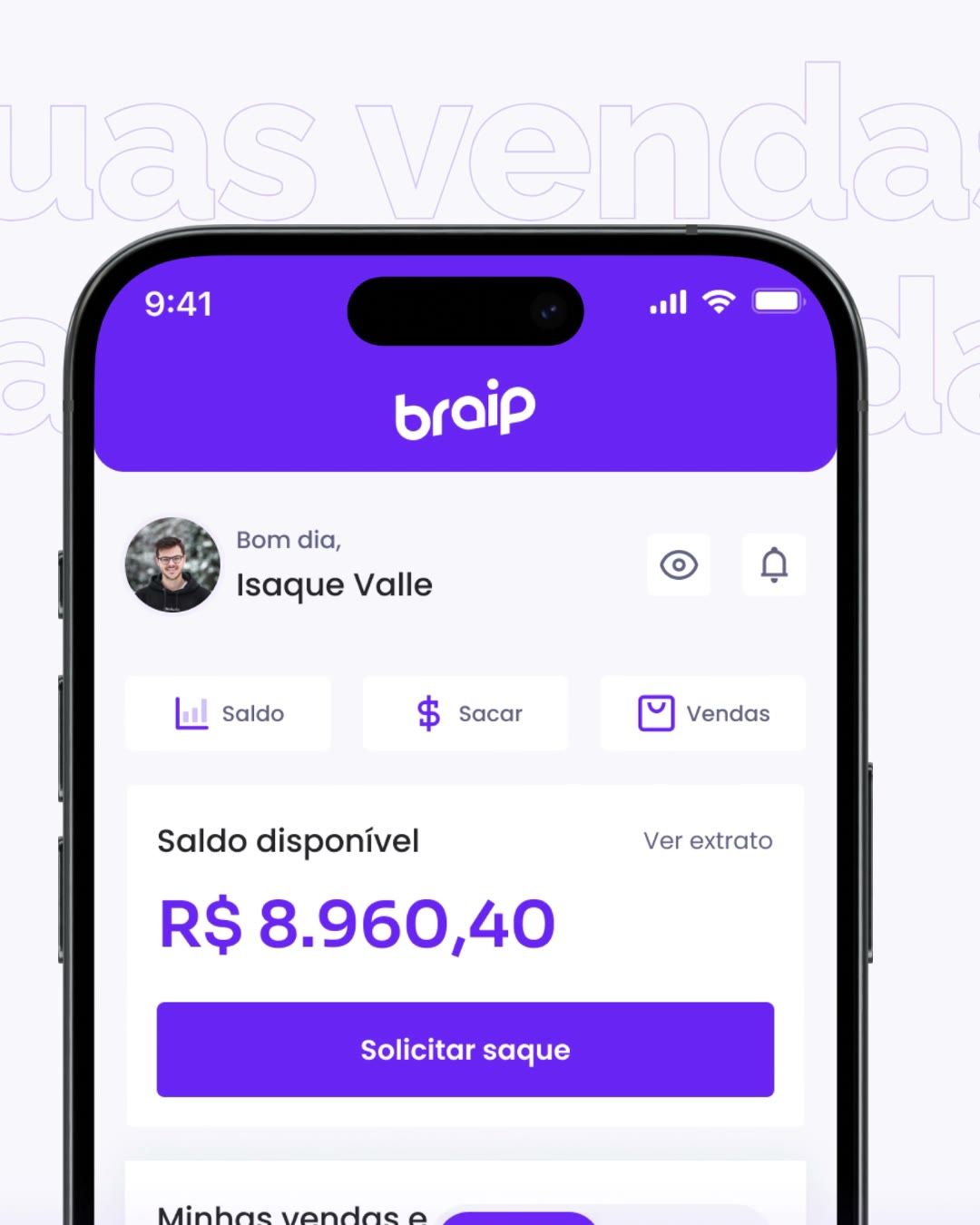
- I scripted a 60-second film in five acts, one per seller question, animated with the app's real screens and the design system's motion curves.
- Outcome
- The film in two formats (feed and stories), the brand opener and the One Page motion pieces, delivered for launch.
Opener
The padlock opens and the brand comes in before the product.
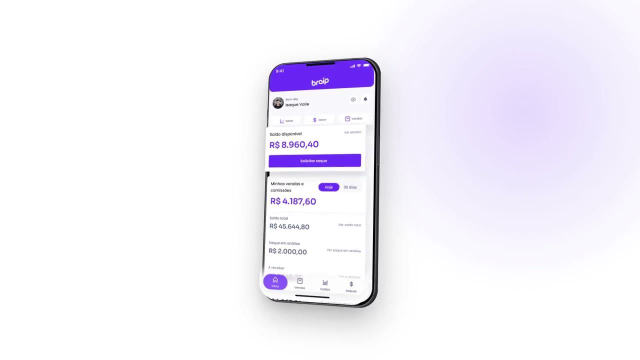
Exploded iPhone
The home layers pull apart on the One Page.
Rising coins
One Page section transition, paced to the scroll.
 02
02 03
03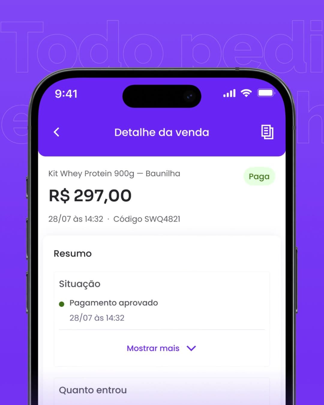 04
04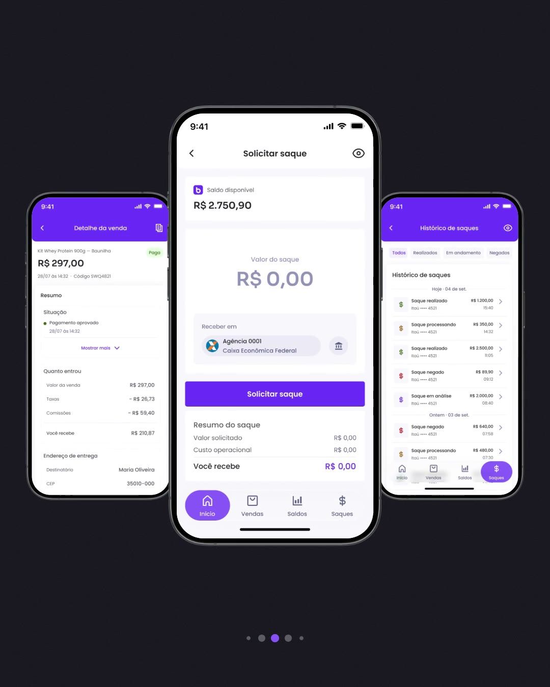 05
05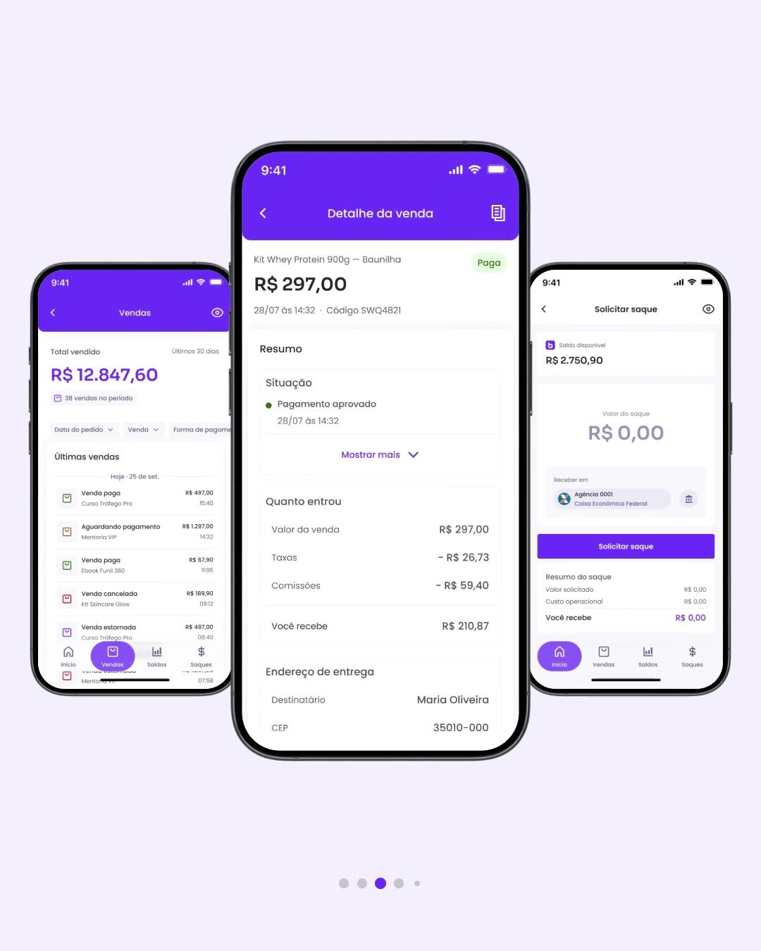 06
06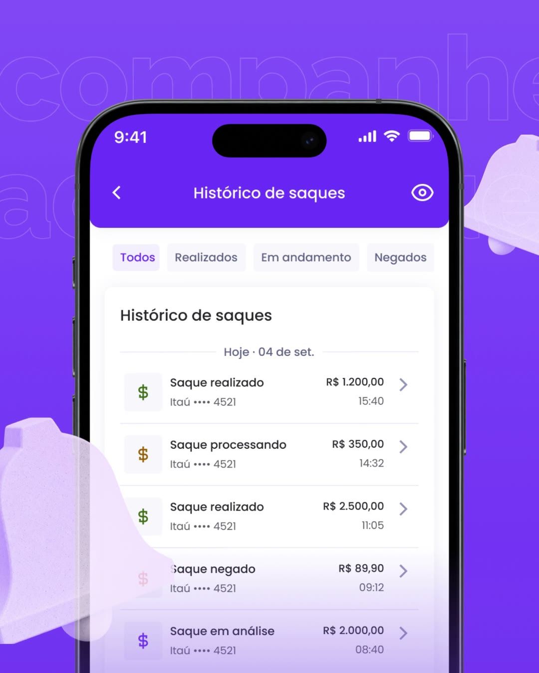 07
07 08
08 09
09
Full processContext, decisions and evidence, for those who want the detail.
One question per act
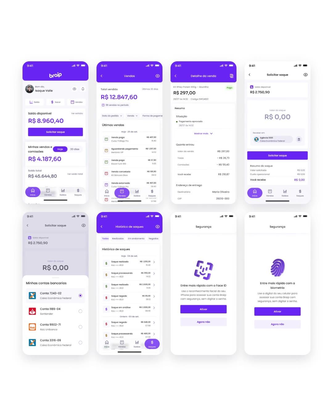
The film follows the questions a seller asks when opening the app. Each act has one line, one real screen and one movement.
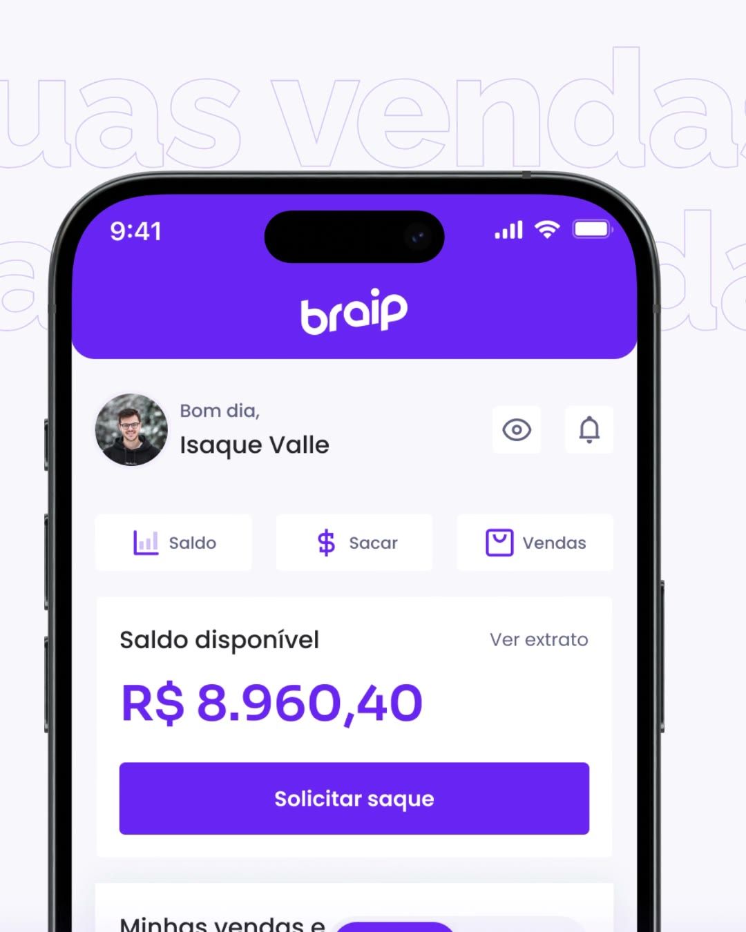
Sales

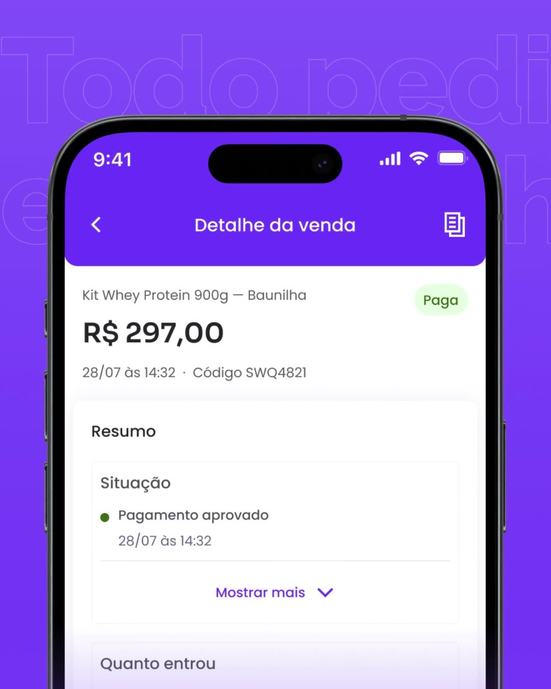
Withdrawals
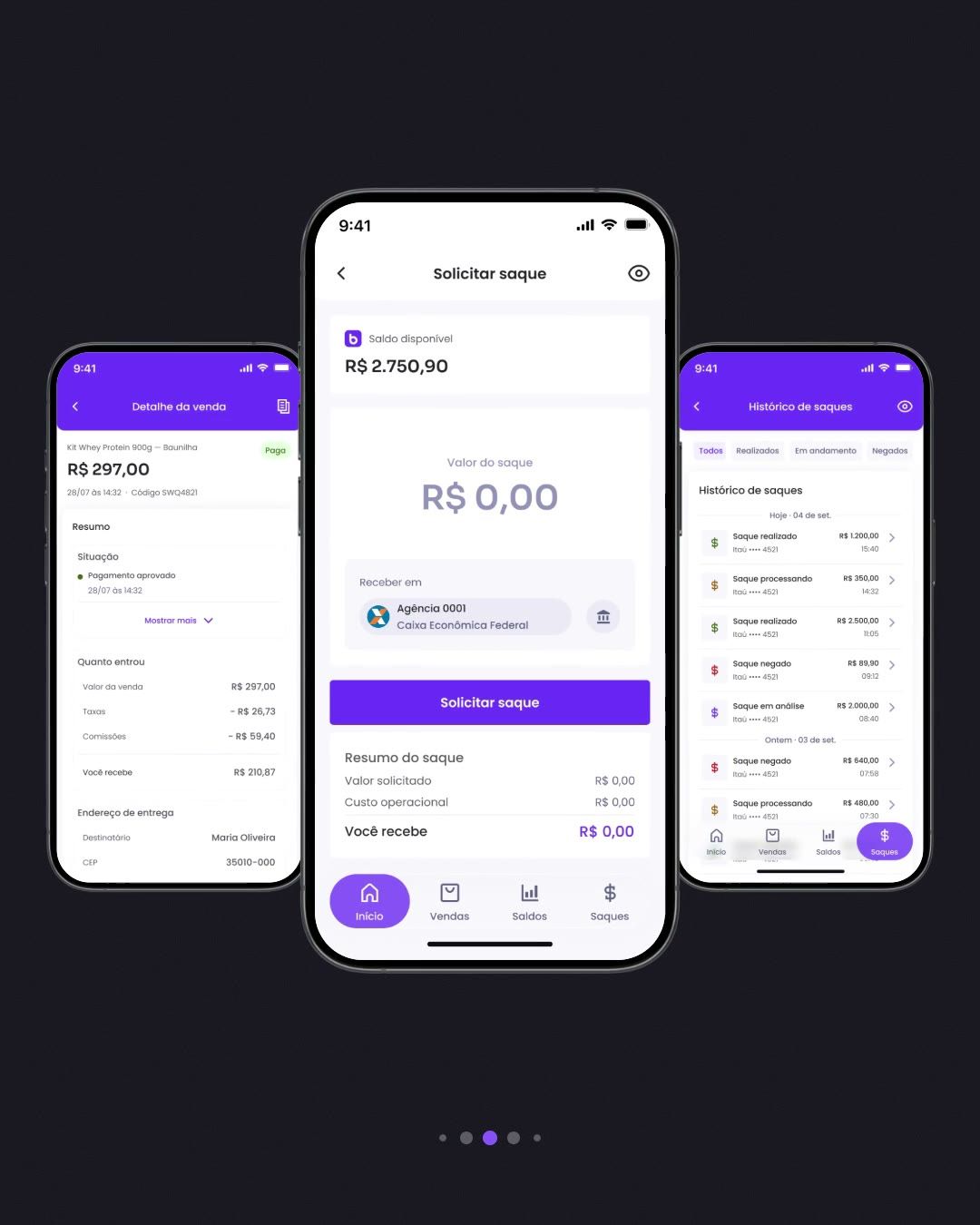
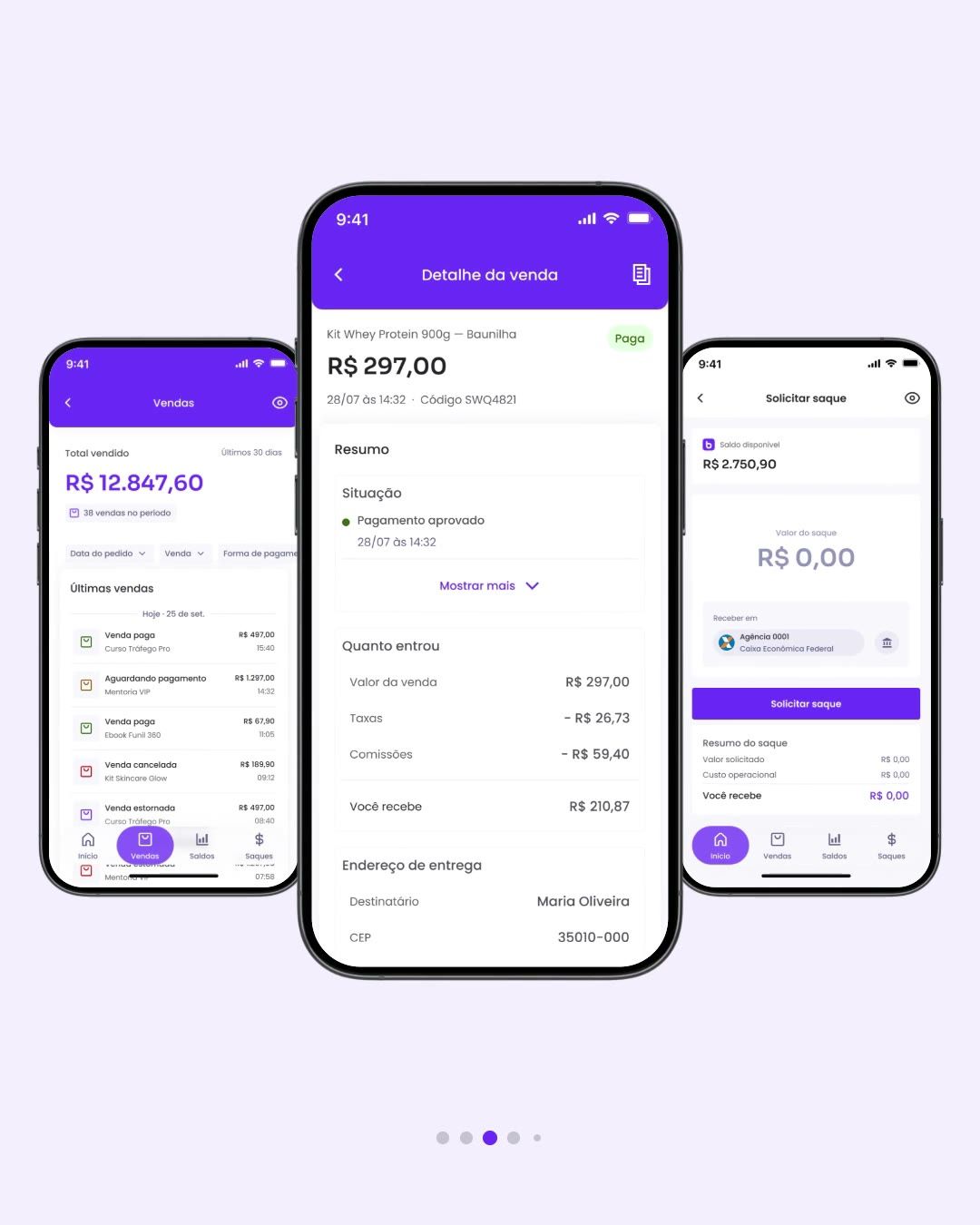
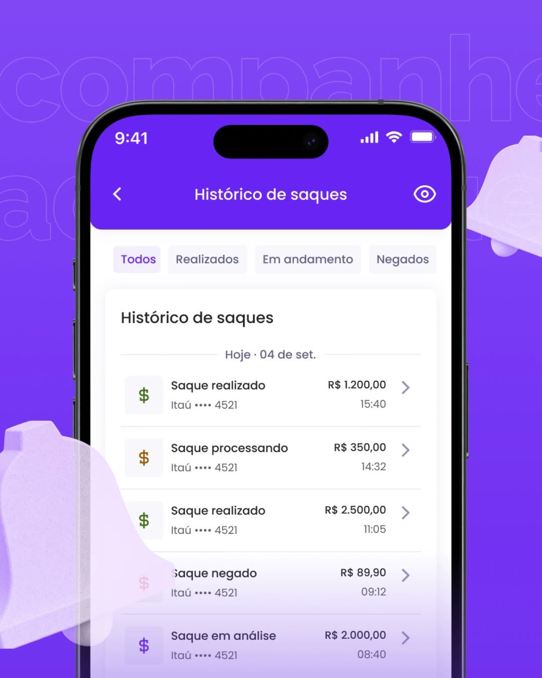
Security and close


How it was made
- Script before animation. 120 BPM, every cut on the beat, 1,800 frames per format.
- Real screens, not rebuilt mockups. The artwork comes from the app file, in layers, so it can split and rotate in 3D.
- Same curves as the product. Enters and exits use the design system's motion curves; the film moves like the app.
- Deterministic render in HTML + GSAP with HyperFrames, in 4:5 and 9:16 from one source.
The screen design lives in the Braip App v2 case; this one is only the launch. Reach metrics stayed with Braip's marketing team.
What I'd do differently
I'd start with 9:16. I built the 4:5 feed first and adapted stories afterwards, and the coverflow lost side room in the vertical cut — designing for the narrower frame and opening up to the wider one would have been simpler.
Outcomes are qualitative: I'm not cleared to publish these projects' metrics.
 Next →Braip App v2Your sales in the palm of your hand.